№ 111 | Art in Board Games, Don't be a Pug in a Bag , Building a Thinking Infrastructure, the Augmentation Canvas, Women’s Clothing Sizes, “Hat, Haircut, or Tattoo”, Phantom Obligations, and Joy Cards (Volume 2)

Welcome to another edition of the Thinking Things newsletter, your regular roundup of ‘playful things to think with’ and think about.
Art in Board Games
I’m very interested in the information design of board games. This is not that. What begins as commentary on updated art for the game Quacks (of Quedlinburg), quickly shifts to something more: A deep dive into “HOW is ART Important in Board Games?”
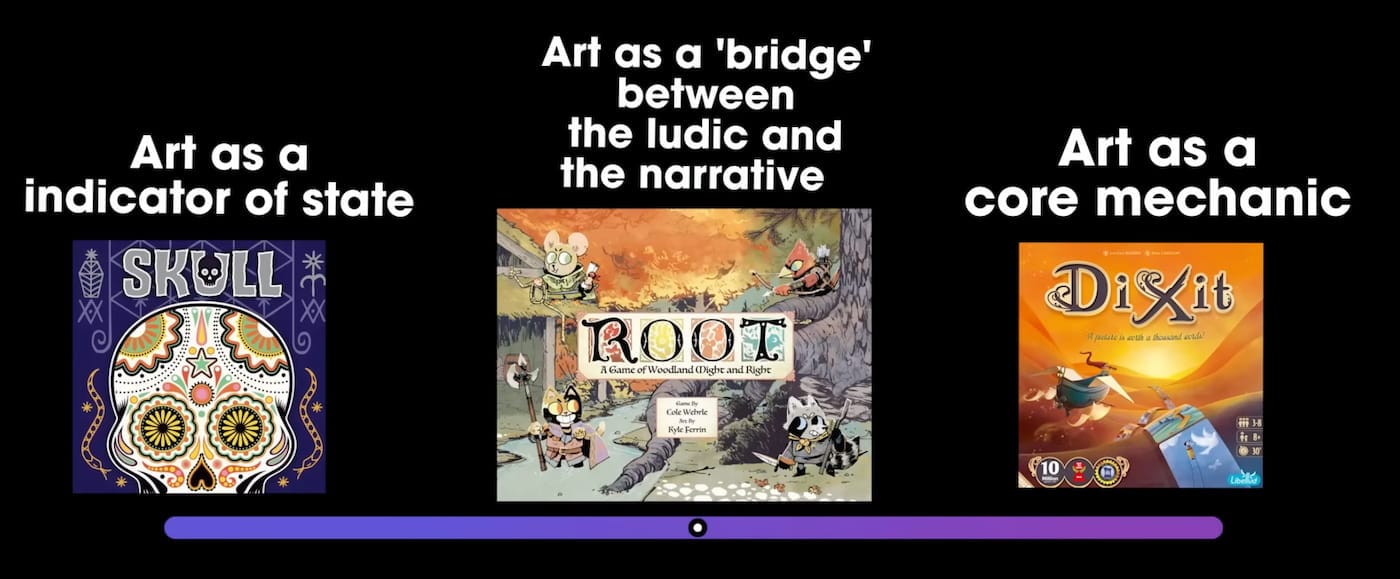
Definitely watch, and watch all the way to the end—the “soul swap” explanation for what has happened with Quacks is still echoing in my head!
(File under ‘things to think about’).
Don't be a Pug in a Bag
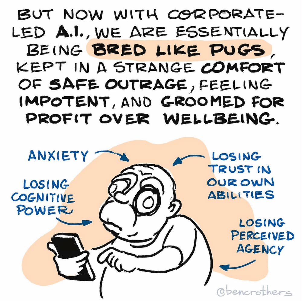
I love this analogy: Don't be a Pug in a Bag [LI].
Please don’t exchange so much of your cognitive power, agency, awareness, mental health, and trust in your own knowledge, intuition and creativity, for - what - a bit of convenience? by using corporate-led gen-AI for everything, that you become the equivalent of a pug in a bag: powerless, helpless, and anxious.
.
NOTE: My AI related finds tend to be of the critical variety. As someone deeply devoted to helping people think for themselves, my chief concern is how these LLMs affect our ability to think critically about a topic. Any topic. Please, don’t become a pug in a bag. I know from daily experience, the simple act of writing out our thoughts, or better, drawing difficult concepts, is a way of thinking. Anything that bypasses this process is deeply concerning. That (re)stated, I want to share two posts on how to approach using LLMs in a way that supports our thinking.
Using Claude to build a “thinking infrastructure”
I love what my friend Ryan Rumsey describes in his post Claude Cowork for Designers, using Claude Skills to essentially clarify, externalize, and codify his own expertise.
The last few months, I've been using Claude in a way that designers, PMs, Engineers, Leaders, etc. aren't really talking about yet. Not for coding prototypes. Not for prompting artifacts. But for building what I'd call thinking infrastructure: systems that structure logic and judgment so I or others can access it when needed.
The interesting part isn't the systems. It's what happens when you try to build them…
Every time I tried to codify my own methodology, it forced me to articulate something I'd previously just known intuitively. The act of making the implicit explicit, of putting my judgment into words clear enough for a agent to use, was itself a form of development I hadn't expected.
I’ve long maintained that conversations and dialogue are a form of thinking. When I’m describing an idea for a new talk to someone, that very act of describing the idea as well as the questions that follow, are ways we think about a topic.
The conversation in this case is with an LLM. But, it is in this process of writing with Claude, and building out a reference library, that Ryan is clarifying his own thinking.
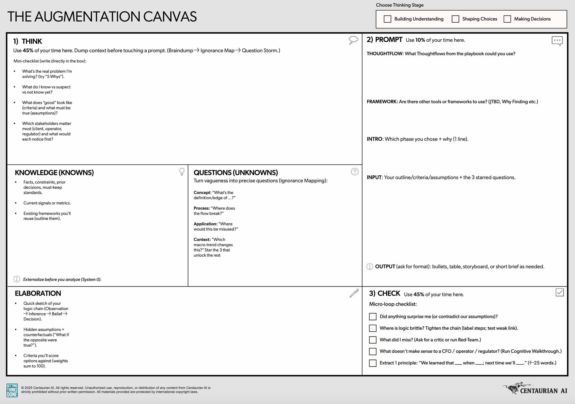
The Augmentation Canvas
In various posts on LinkedIn, Kes Sampanthar and Scott Wolfson have been sharing The Augmentation Canvas [LI], a (you guessed it!) canvas to “help people think WITH machines, not just use them.” The canvas asks us to follow a simple “Think → Prompt → Check” process, with a recommended split of 45% of your time thinking, 10% prompting, and 45% checking.
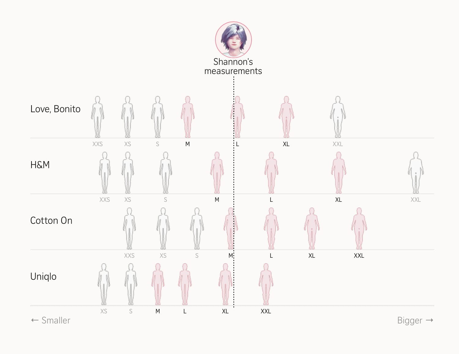
Inside the confusing world of women’s clothing sizes
By way of the Best Data Visualization Projects of 2025 comes this interactive explanation taking us inside the confusing world of women’s clothing sizes. 🫨
Aye yai yai!
Engaging, informative, and visual (yay!), this is a fun, data-driven look into why shopping for women’s clothes can feel like a guessing game. And, why one person might have sizes on the tags ranging from M to XXL.
For a bit of levity, check out the “058 Motorway Cycle XI” (also in the data visualization roundup), where traffic patterns are transformed into a tranquil bit of music.
“Hat, Haircut, or Tattoo”
There’s a good chance you’re now familiar with the notion of a decision being a “one-way door” (irreversible) or a “two-way door” (reversible). If not, you can check out Issue № 42 where I shared both the door metaphor and a similar one involving waterlines. (Oh, and more recently in Issue № 109, I shared a 2x2 framework for making decisions!)
Anyway… here’s a simple decision making metaphor that may replace the doors metaphor, if only because there’s a bit more nuance: Is this decision a hat (try on and take off), haircut (you’re stuck with for a while), or tattoo (permanent)?
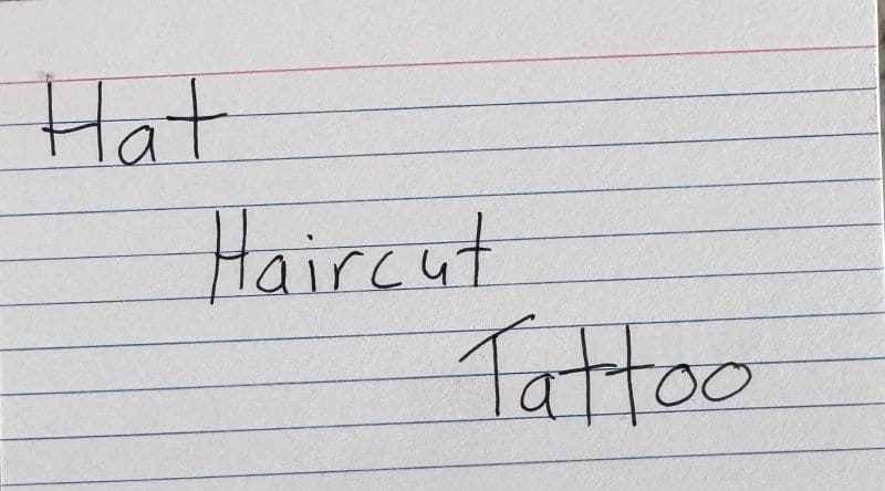
I lost the source that brought this to my attention, but they cited James Clear as the creator of this metaphor:
Most decisions are like hats. Try one, and if you don’t like it, put it back and try another. The cost of a mistake is low, so move quickly and try a bunch of hats.
Some decisions are like haircuts. You can fix a bad one, but it won’t be quick, and you might feel foolish for a while. That said, don’t be scared of a bad haircut. Trying something new is usually a risk worth taking. If it doesn’t work out, by this time next year, you will have moved on, and so will everyone else.
A few decisions are like tattoos. Once you make them, you have to live with them. Some mistakes are irreversible. Maybe you’ll move on for a moment, but then you’ll glance in the mirror and be reminded of that choice all over again. Even years later, the decision leaves a mark. When you’re dealing with an irreversible choice, move slowly and think carefully.
“Phantom Obligations”
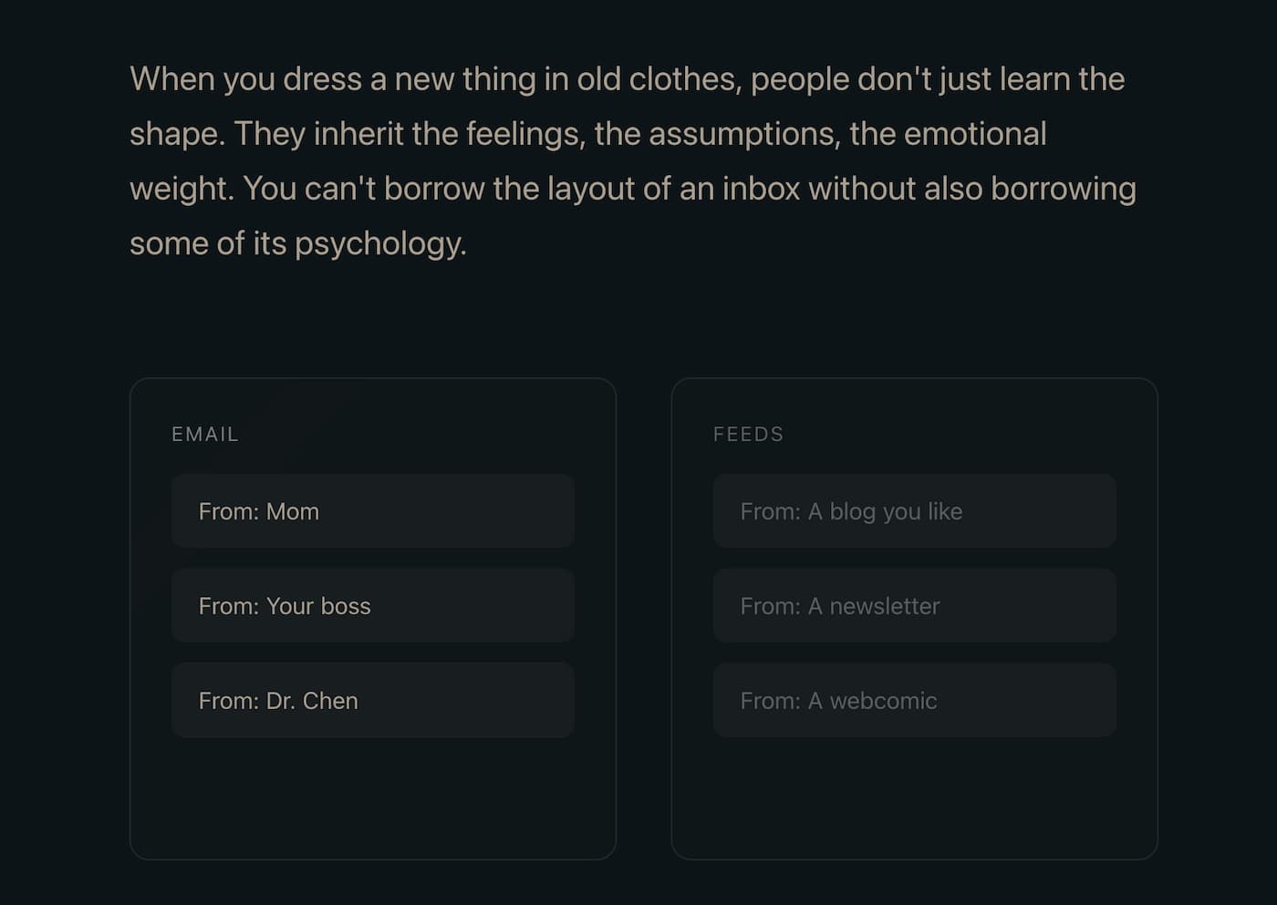
This short essay on Phantom Obligations does an effective (and engaging!) job of framing a curious problem: Why do RSS readers look like email clients?
Reading this coincided with me looking (once again) for a better way to separate out email newsletters from regular emails. This passage crisply articulated for me the fundamental tension:
When you dress a new thing in old clothes, people don't just learn the shape. They inherit the feelings, the assumptions, the emotional weight. You can't borrow the layout of an inbox without also borrowing some of its psychology.
Email's unread count means something specific: these are messages from real people who wrote to you and are, in some cases, actively waiting for your response. The number isn't neutral information. It's a measure of social debt.
But when we applied that same visual language to RSS (the unread counts, the bold text for new items, the sense of a backlog accumulating) we imported the anxiety without the cause.
Seen through this lens, it’s kind of maddening that I’d consent to mix important emails from people who wrote to me, with… everything else.
The best part of this essay? Imagining better.
So what would it look like to start over? Not to build a better inbox, but to imagine entirely different metaphors? The River? the Campfire? The Window? The Library?
I'm not here to tell you that one of these metaphors is correct and the inbox is wrong. I'm here to point out that we have more choices than we've been exercising.
Yes, it’s essentially a teaser page for an in-development product. But… the thinking–the product sense–is sound.
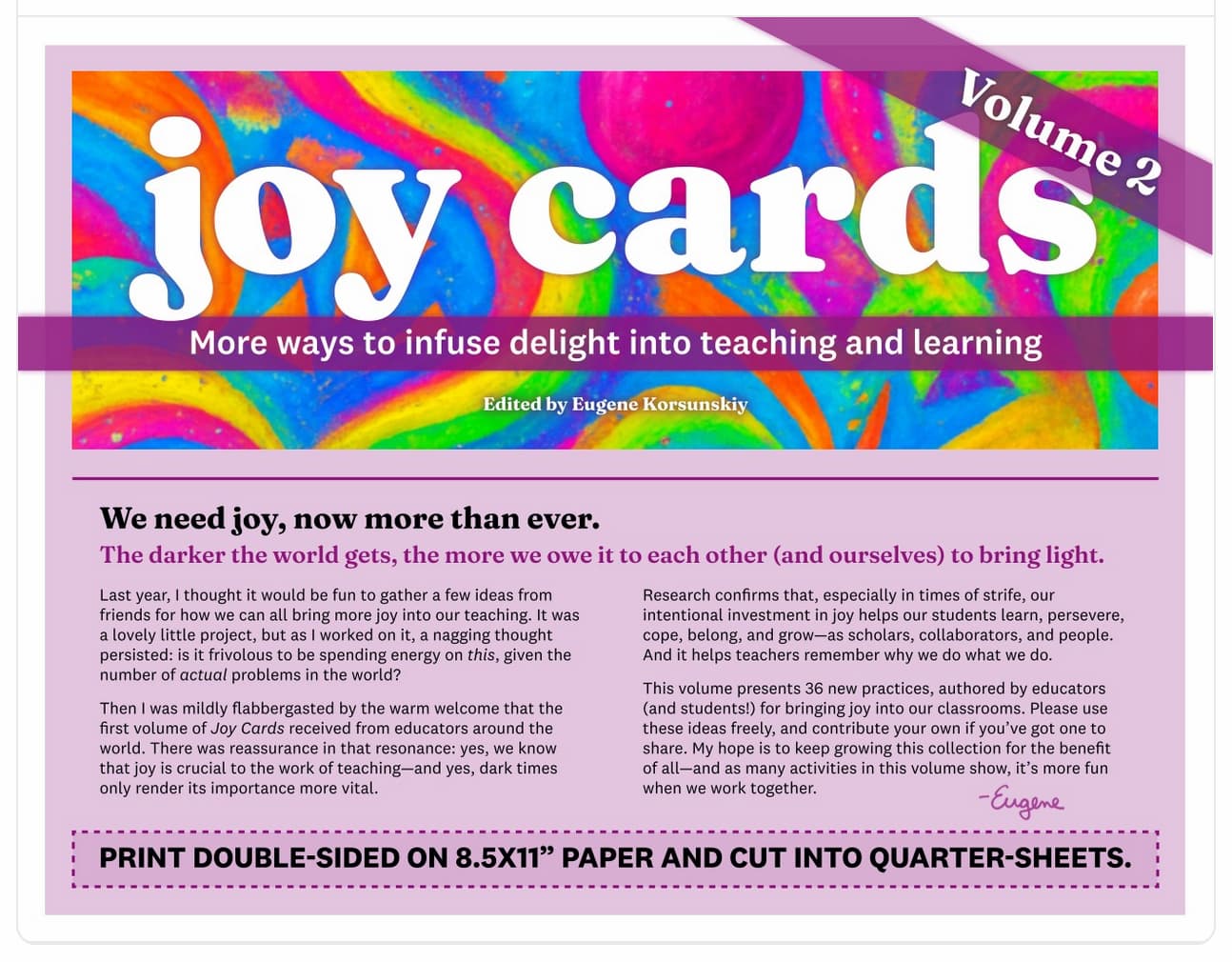
Joy Cards (vol 2)
Back in Issue № 86 I shared the Joy Cards, pitched as “tiny ways to infuse joy and delight into your work, in the classroom and beyond!” Now, the creator is back with Joy Cards Volume 2 [LI].
This collection has 36 new ideas—authored by educators (and students!)—for how we can bring more delight into teaching and learning.
This project has been a real treat to work on (and not only because it gave me the excuse to make silly doodles for the illustrations). It's been really heartening—especially in the times we're living in—to get to devote some real time and energy to taking seriously the importance of fun in everything we do as educators.
Random Stuff
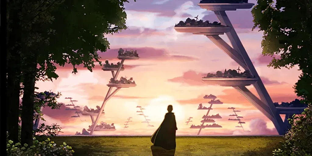
I just saw Arco, one of the Oscar nominees for Best Animated Feature. It’s also in theaters right now (at least in the US). If you can see it, do so. It’s… kinda magical. The story is about…
A10-year-old boy from a peaceful future… accidentally travels back in time to the year 2075. Discovering a world in peril, he bands together with a young girl and her robot caretaker as he sets out on a quest to return home.
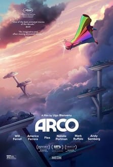
Evocative worldbuilding. Rich and inspiring themes. Sacrificial love. Human connection. Hopeful visions of the future (the FAR future, that is). Nuanced details that are easy to miss. Original images that’ll stay with you long after the film ends… Candidly, this might be my favorite movie from 2025.