№ 91 | Short Films as ‘Playful Things to Think With’, The Workshop Map, Meeting Solar System, A Field Guide to Hype, The Time is Now Toolkit, and Two Short Posts on Cognition

Another issue. More playful ‘things to think with’ and think about!
Short Films as ‘Playful Things to Think With’
I’m going to ‘cheat’ a bit, and share something I just published: Short Films as ‘Playful Things to Think With’.
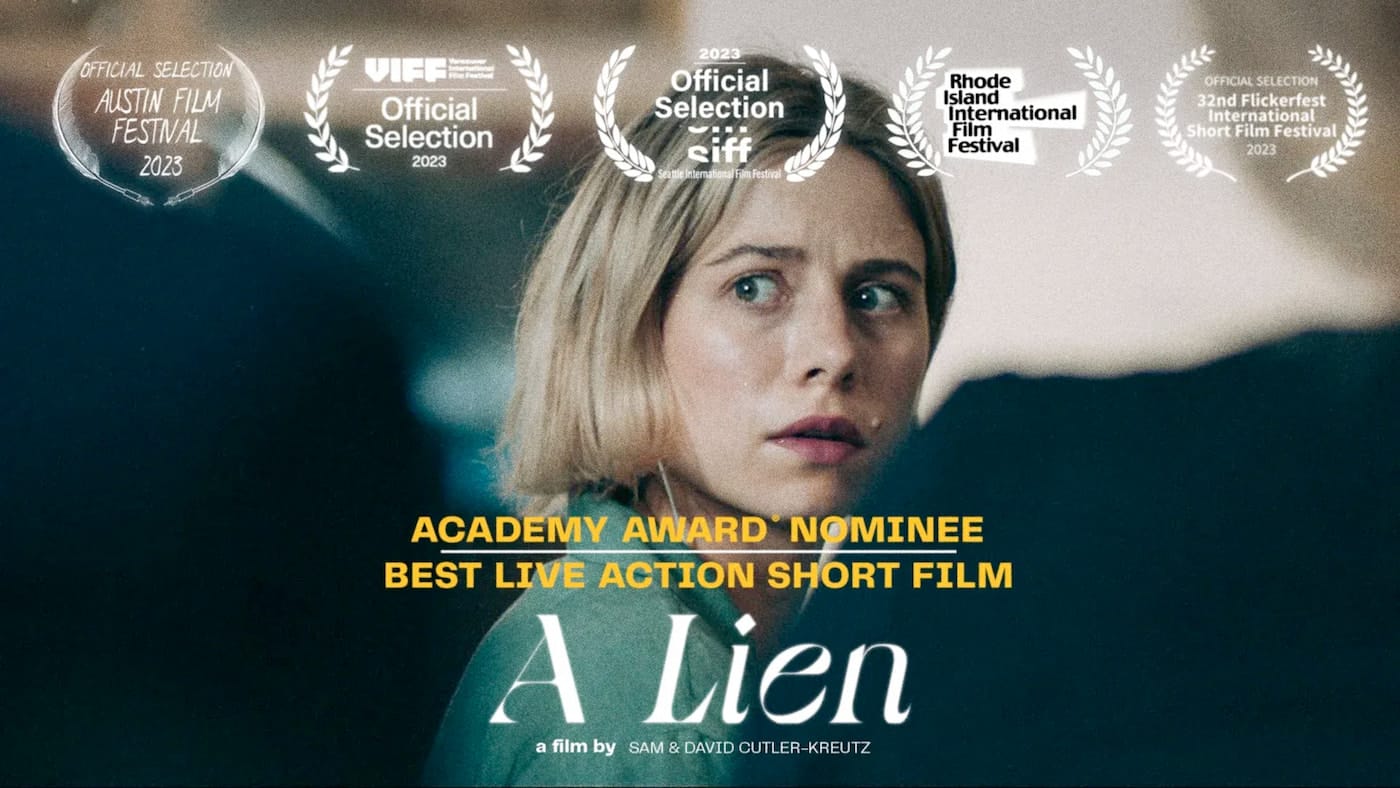
Before the Oscar season gets too far off in the rear view mirror, I wanted to share a perspective on 3 of this year’s nominees for best live action short film. The films I’ve selected (in the post) each show us people in difficult situations.
- People, we identify and empathize with.
- Situations, we can relate to, however indirectly.
Even if we’ll never be in that situation, we are — for the duration of that film — immersed into that experience. And asked to answer a really hard question…
(Read more in the linked post.)
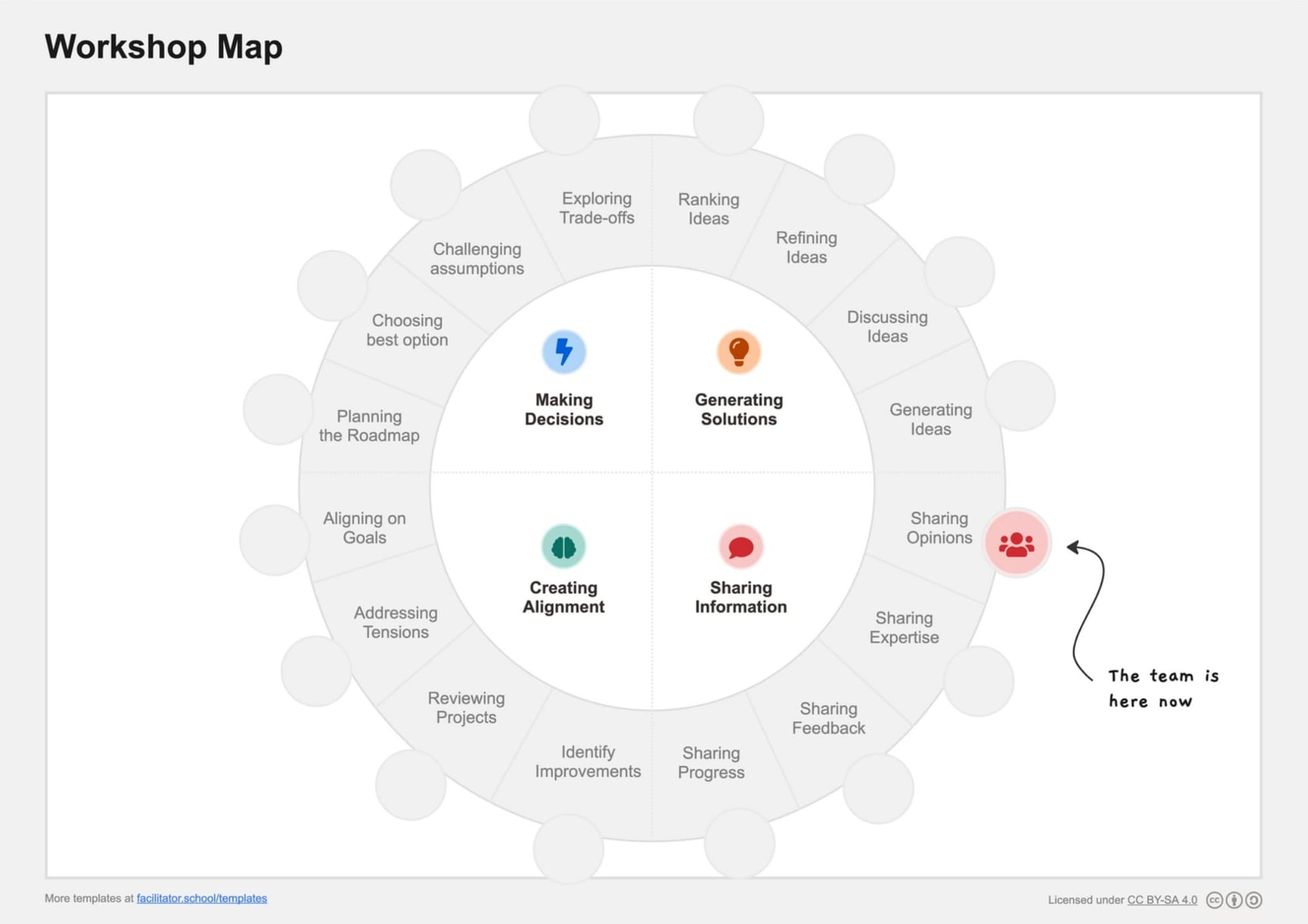
The Workshop Map
What if… we shared a common workshop map. I’m not talking about an agenda, or an order of planned activities—those are too specific. Rather, a generalized map of “where are we right now?” to signal the intended outcome of whatever it is we’re doing at this moment. And a way to signal—explicitly—when we’ve shifted or about to shift our focus.
I believe that’s the general idea of The Workshop Map. Needless to say, this is something I’ve been thinking a lot about, since it was first shared on LinkedIn.
These are things facilitators and meeting organizers think about when planning a gathering, but what if these intentions were made visible while meeting, for all to see and reference? My friend Chris Lunney perfectly articulates the value of such a move:
I love how much this can place agency back in the hands of the participants who are actively moving through the unknown. One of the scariest things is to feel that we're in a place of ambiguity and have no agency to make the next move. This is an incredible invitation to regift that agency to participants.
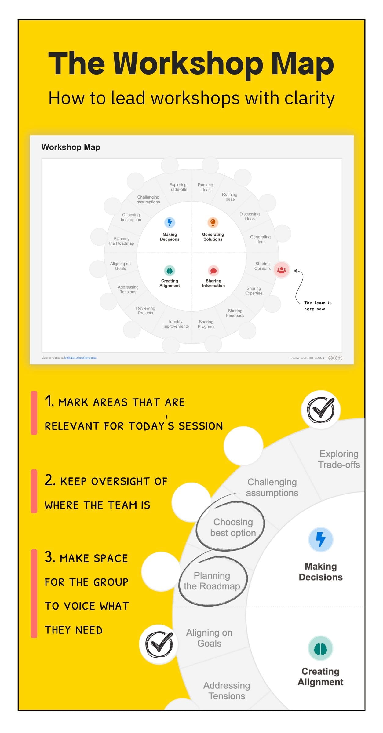
I’m still wrestling a bit with the IA of the 4x4 generalized intents (where is “Connecting” for example?). But, I feel like this is a big step in a good direction. And as you’d expect from me, I can already see the board game version of this! 😆
Speaking of meetings…
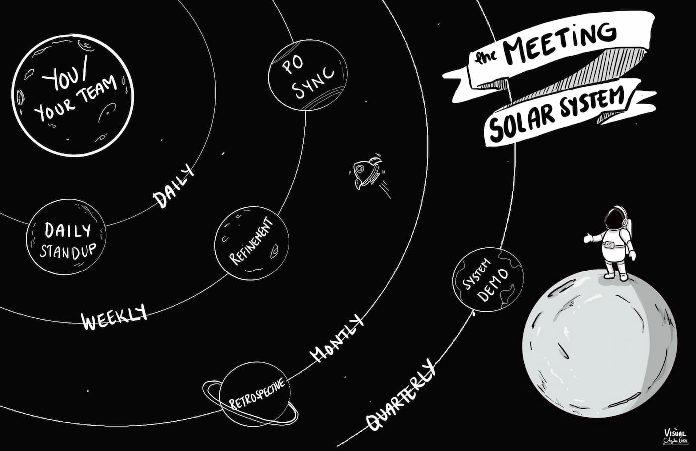
The Meeting Solar System
I once worked on a project to visualize the “rhythm of business” —the system of recurring and interrelated meetings that most companies have—intentionally or not—to some degree. For a dev team, think of daily standups, end-of-week show and tells, sprint planning, retros, monthly share-outs to other teams and departments, quarterly goal setting, and so on. In hindsight, my thinking was mostly constrained by time-based frames, such as calendars, timelines, and music scores. This is what makes the “Meeting Solar System” metaphor all the more refreshing for me—it’s a fantastic (and readily understood metaphor) for visualizing this constellation of meetings. A frame to think with. 😉
A solar system has a star (or Sun) at its centre – that’s You, Your Team, Your Function. The meetings are the planets that orbit the Sun to which they are gravitationally bound – so related or tied to in some way.
And more than just this lovely sketch from The Visual Agile Coach, there’s also a Miro template teams can use to map out their unique constellation of meetings.
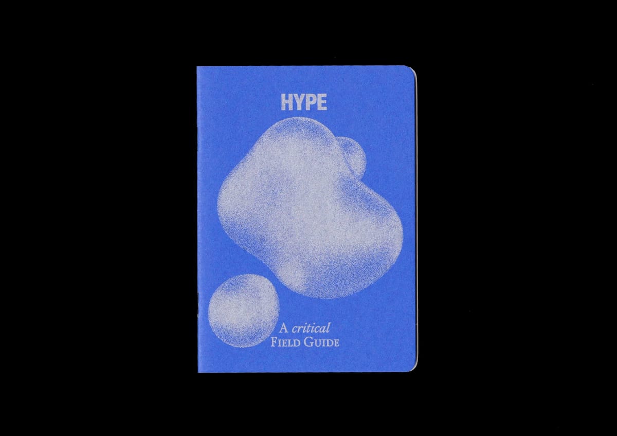
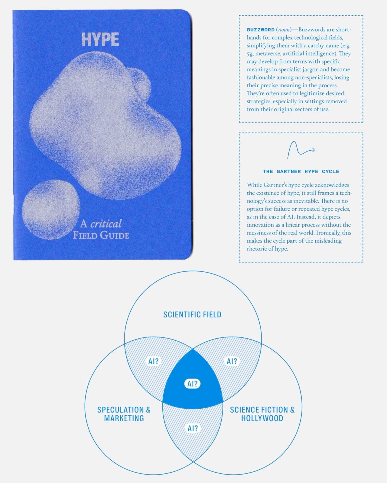
A Field Guide to Hype
Beautifully designed? ✅
Information rich? ✅
Exploring a nuanced concept? ✅
In a tiny, accessible format? ✅
A Field Guide to Hype, pitched as “your daily companion to hype — its uses and misuses,” checks all the boxes. And it’s only a few [insert local currency]!
What really sold me is this remark from Frank Kumli (LinkedIn):
Do not get fooled by the format (postcard size, 30 pages), this beautifully layed-out booklet beats many of the 300+ pages business books I have read recently!
That, and its characterization as a zine!
Oh, and I love this promise: Become a skilled surveyor of the modern hype landscape and a masterful poker of holes into the narratives of technology.

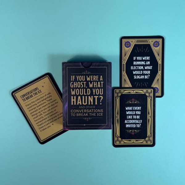
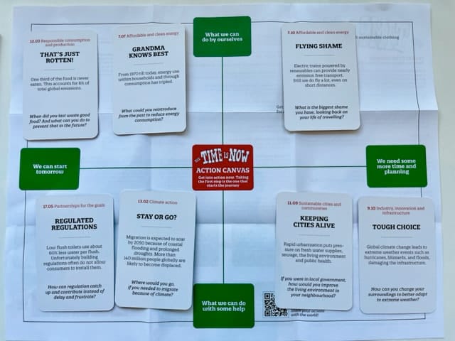
The Time is Now Toolkit
“A toolkit for serious change” sounds like my kind of game! The Time is Now is your typical ‘questions for discussion’ style card deck, with a bold claim: “The Toolkit generates more effective ideas than any other toolkit within the hour.” The focus here is on possible responses to climate change issues, and from what I see of the questions, they seem well-designed to open up exploratory conversation:
What would your holiday look like with zero CO2 emissions?
Or, when acknowledging that much of the climate impact takes place out of view:
How could we make climate impact from production and transport more transparent to consumers?
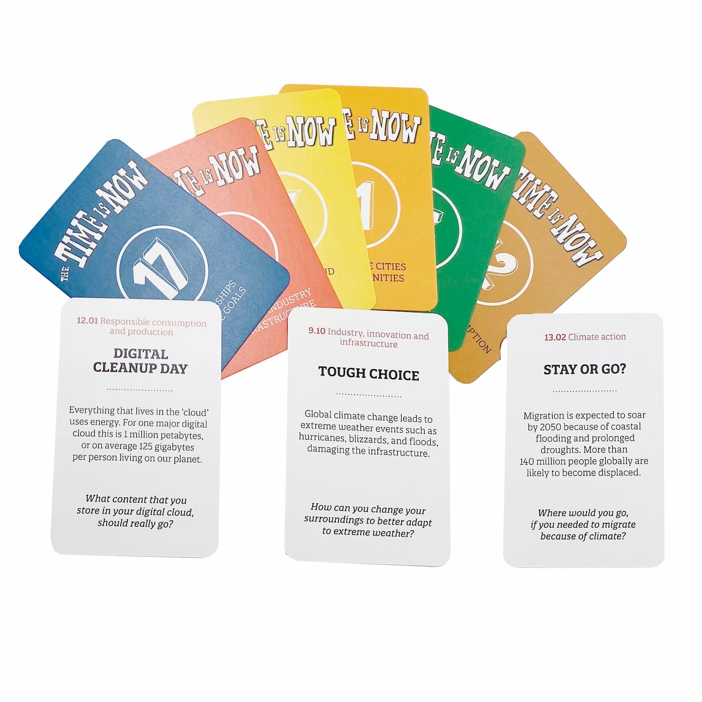
Even better, the 6 suits in this deck are each aligned to 6 of the 17 United Nations Sustainable Development Goals (SDGs).
I can also add this to my very short list of card decks that come with a framework (folded inside). In this case, it’s a simple 2x2 that challenges players to move from ideation to action:
Two short posts on cognition
In the past few weeks, I’ve come across two short posts, both offering a brilliant bit of commentary on some overlooked aspect of cognition.
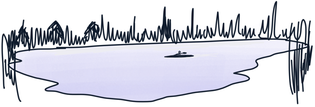
The first of these, “Beyond the Moment: How Visual Artifacts Preserve Understanding,” manages to capture an idea I’ve struggled to convey succinctly: Why persistence of information is so critical to thinking.
Verbal information flows like rivers—rushing past one piece at a time. Visual information exists like lakes—all elements visible all at once.
The second post concerns another idea I sometimes have trouble articulating: When is it overreaching to do cognitive work on behalf of others, even if well-intended? “Avoid the nightmare bicycle” celebrates our capacity to learn and figure stuff out.
People are capable!
One of the worst misconceptions in product design is that a microwave needs to have a button for every thing you could possibly cook: “popcorn”, “chicken”, “potato”, “frozen vegetable”, bla bla bla.
You really don’t! You can just have a time (and power) button. People will figure out how to cook stuff.
Good designs expose systematic structure; they lean on their users’ ability to understand this structure and apply it to new situations. We were born for this.
Bad designs paper over the structure with superficial labels that hide the underlying system, inhibiting their users’ ability to actually build a clear model in their heads.
With both of these posts, there’s more than what I’ve cited here—definitely check them out!
Random Fun Things…
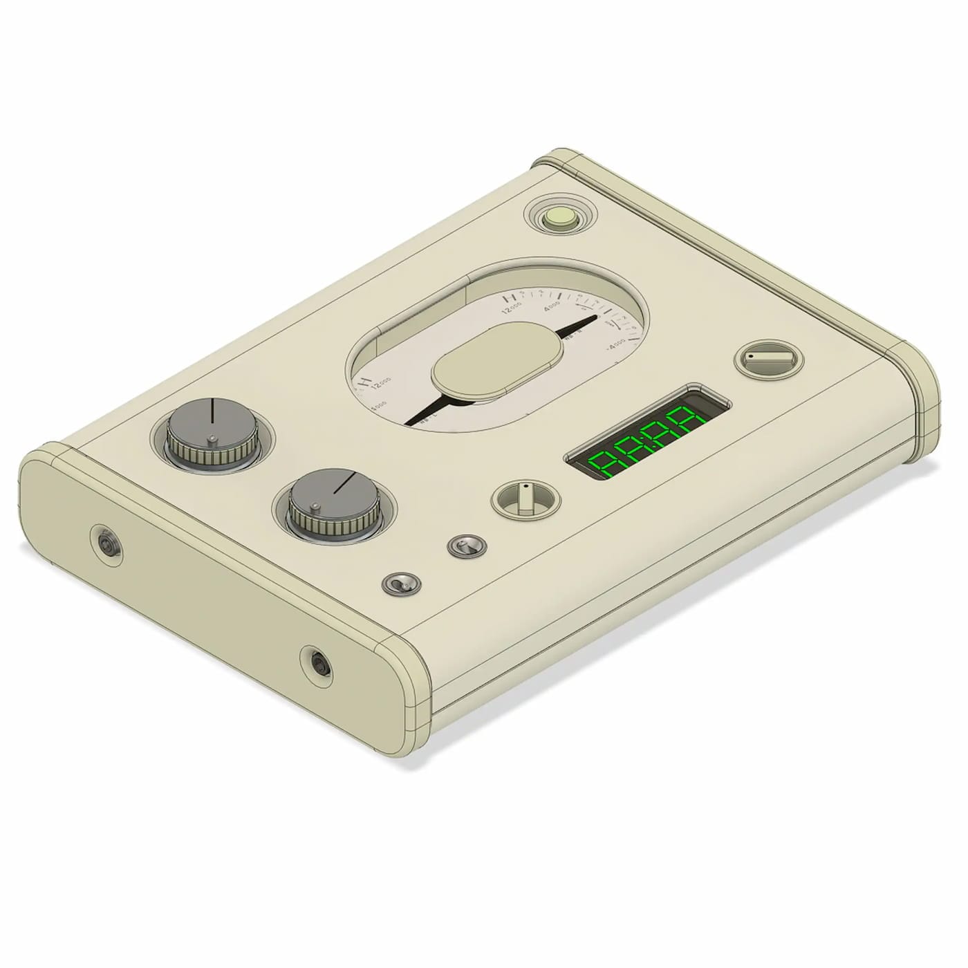
I’ve really enjoyed the behind-the-scenes care and craft that's gone into the TV series Severance. The story behind this prop—the Lumon Industries WoeMeter—is one such example.