№ 122 | A “Horseshoe” Diagram, Slow AI, the Data Communication Triangle, The Invisibles, A Simple Clustering Algorithm for Lists, Ordinary Abundance, and “Certainty, Variety, and Delight”

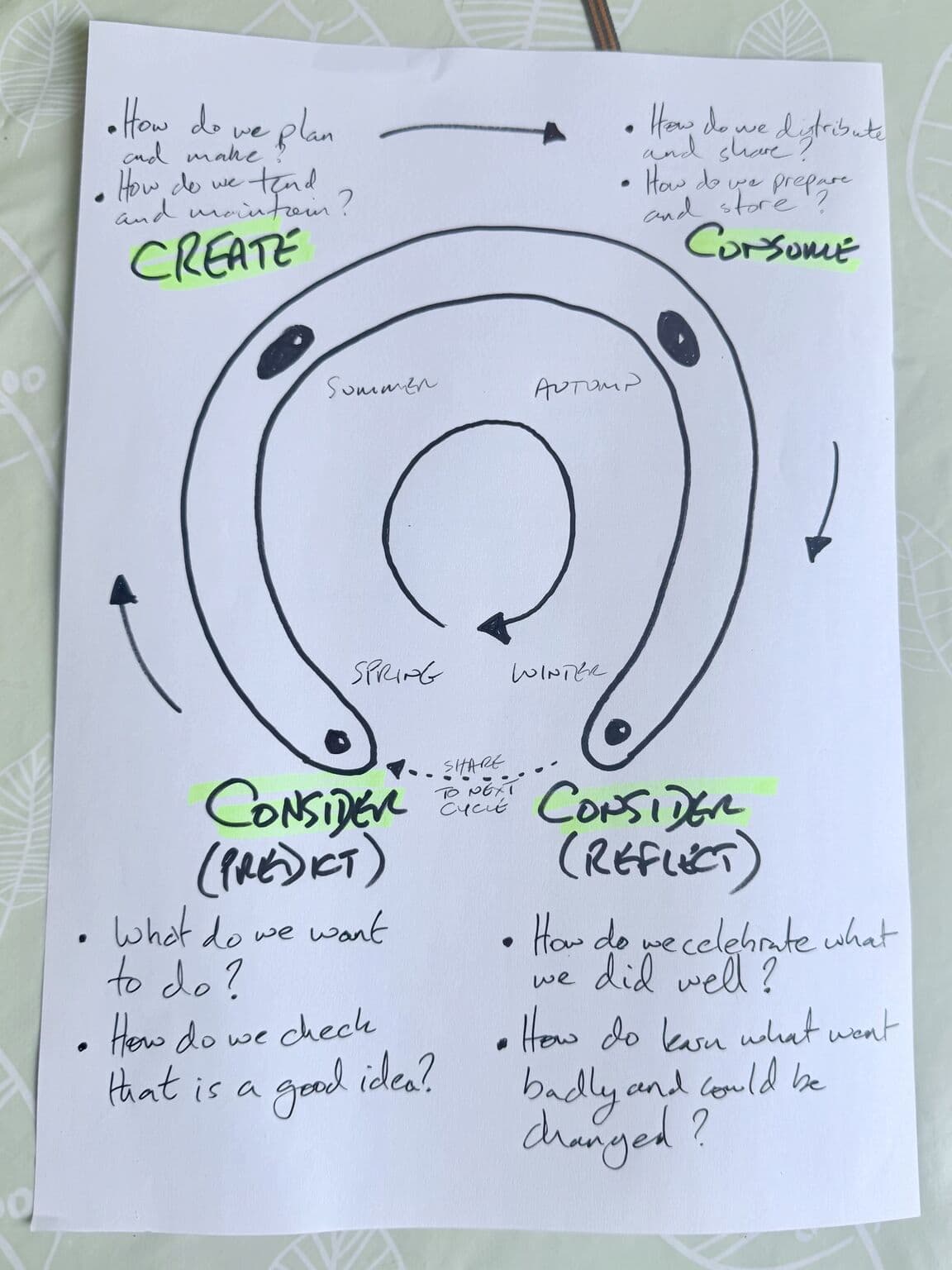
A ‘horseshoe’ diagram
Ooh… A horseshoe diagram?! That’s a new-to-me pattern; I’m adding this to my collection of visual primitives. Pretty much a cycle, with emphasis on the starting and ending points (before the cycle begins again). That’s all.
Oh, and as for the content of this model, I feel it’s self-explanatory: Per Alastair: “For a community food project, a horseshoe diagram of design thinking.”
🤩
Note: The sketch version of this model came from this LinkedIn post.
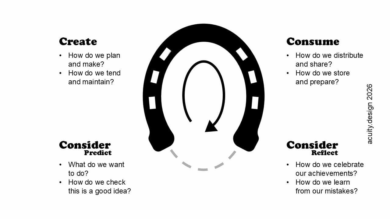
Connecting some dots… flip the horseshoe vertically, and this brings to mind how The Hero’s Journey is often depicted. Sure, it’s called a cycle, like that of a clock, but it’s discussed as a model with a clear beginning and ending (with a journey into the abyss along the way!).
Two games about Slow AI
I often think about the TV show Travelers. Spoiler: In the far future, to save ourselves from ourselves, we’ve turned over all decision making and judgement to an almost all-knowing AI. This was in 2016, when our popular view of AI was more deterministic (rather than probabilistic). But, that premise has stuck with me.
Why do I mention this?
I recently stumbled across two mini games from Sam Millingworth, a Professor of Critical AI Literacy and advocate for what he describes as “Slow AI… knowing when to use AI and when to leave it alone.”
The first of these two games is Consensus, in which you play “an Archivist in a city that handed every decision to an AI called the System and forgot how to choose.” See the connection? In contrast with Travelers, where a decision to abdicate judgement was made out of desperation, this setting is more of a commentary on AI literacy, our present—impulsive—relationship with AI, and a warning to be vigilant about what we hand over. I found the premise more thought-provoking than the actual gameplay, though beating the boss did begin to feel like chanting a mantra… ‘Check the source’. ‘Follow the money’. ‘Slow down’. Definitely worth the 15 or 20 minutes of playtime.
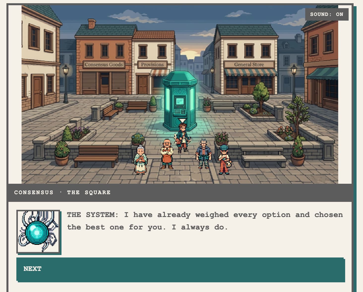
The second of these two games is Just This Once, in which you make a series of choices about how much to offload to AI. There is, of course, an assessment of your choices at the end. Of the two games, I found this one more poignant, if only for the unnerving familiarity of each question.
Both of these games are an on-ramp to Millingworth’s book, newsletter, and other goodies.
One of the choices in Just This Once is to use AI (or to what extent to use AI) to create a quick executive summary. Which is a great segue to…
Data Communication Triangle
Here’s a meta way to think about communications. Fashioned after the popular “Price, Speed, Quality—pick 2” tradeoff, the Data Communication Triangle identifies three key constraints:
Brevity: How much time and space you have to communicate your findingsDepth: The richness of context and evidence you provideComprehension: How well your audience understands the content
(pick 2!)
From here, “the right communication tool depends on your intent for the audience. Are you trying to spark curiosity? Build awareness? Or drive conviction through understanding? Each intent requires a different approach.”
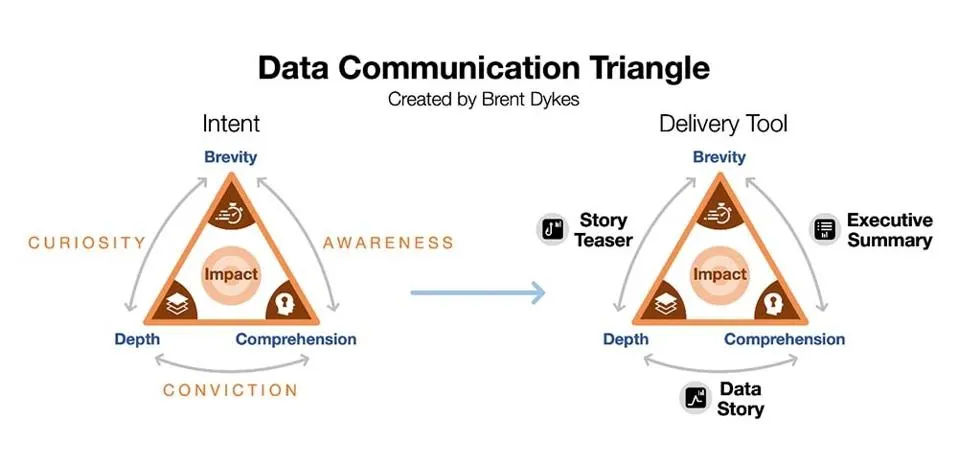
I like this framework for its intended purpose: To support an argument for considering tools other than the well-worn Executive Summary. As to the framework itself… Some of the labels give me pause. Per the model’s definitions, the three anchor concepts aren’t equal: Comprehension belongs to others, Depth is within your control, and Brevity is a bit of both (time allotted and your choice of how to use that time). These misgivings aside, I find this to be an interesting way to think about our modes of communication, especially in a time when everything is trending toward summaries of summaries of summaries—all done by AI. Surely the information loss and lack of understanding are seen as a problem… right?! Or, maybe these summaries are a way for some leaders to avoid the discomfort of sitting with nuance… 🤔
And also… I can’t help but apply this model to the kinds of things I curate here. I frequently advocate for making difficult ideas more accessible—not through dumbing down or cutting content, but by reframing how we interact with that content (emphasis on that word interact!). Hence, games, card decks, simulations, collaboration frameworks, and other playful mediums. For example, the research ‘report’ presented as a trivia game where players (the executive team) get to test their beliefs and predictions against the research findings; when I first observed this, I saw it for what it was: A powerful way to create engagement with nuanced details of the research, and invite clarifying questions. If I look at this Data Communication Triangle through that lens, I feel as if there’s more that could be layered on—modalities, or maybe the entire model is situated within a series of concentric circles so we can assess degrees of brevity, depth, and comprehension.
Anyway, I found this to be a useful framework to think with (as intended) and think about (variations, extending to other applications).
The Invisibles
In my book Figure It Out, I remark that—as human creatures—our sense of vision is the most highly evolved sense (hence, why I’m so big on visual sensemaking!). To emphasize this point, I make a contrast between our visual superpower and the superpower possessed by other creatures, such as dogs, whose sense of smell is their most highly evolved sense.
But, it’s hard to understand and appreciate a sense that we ourselves have a limited understanding of. For this, I found The Invisibles to be illuminating. Framed as a ‘scrolltelling story’, this short interactive piece offers a brief tour of “the chemical languages we speak but cannot hear.”
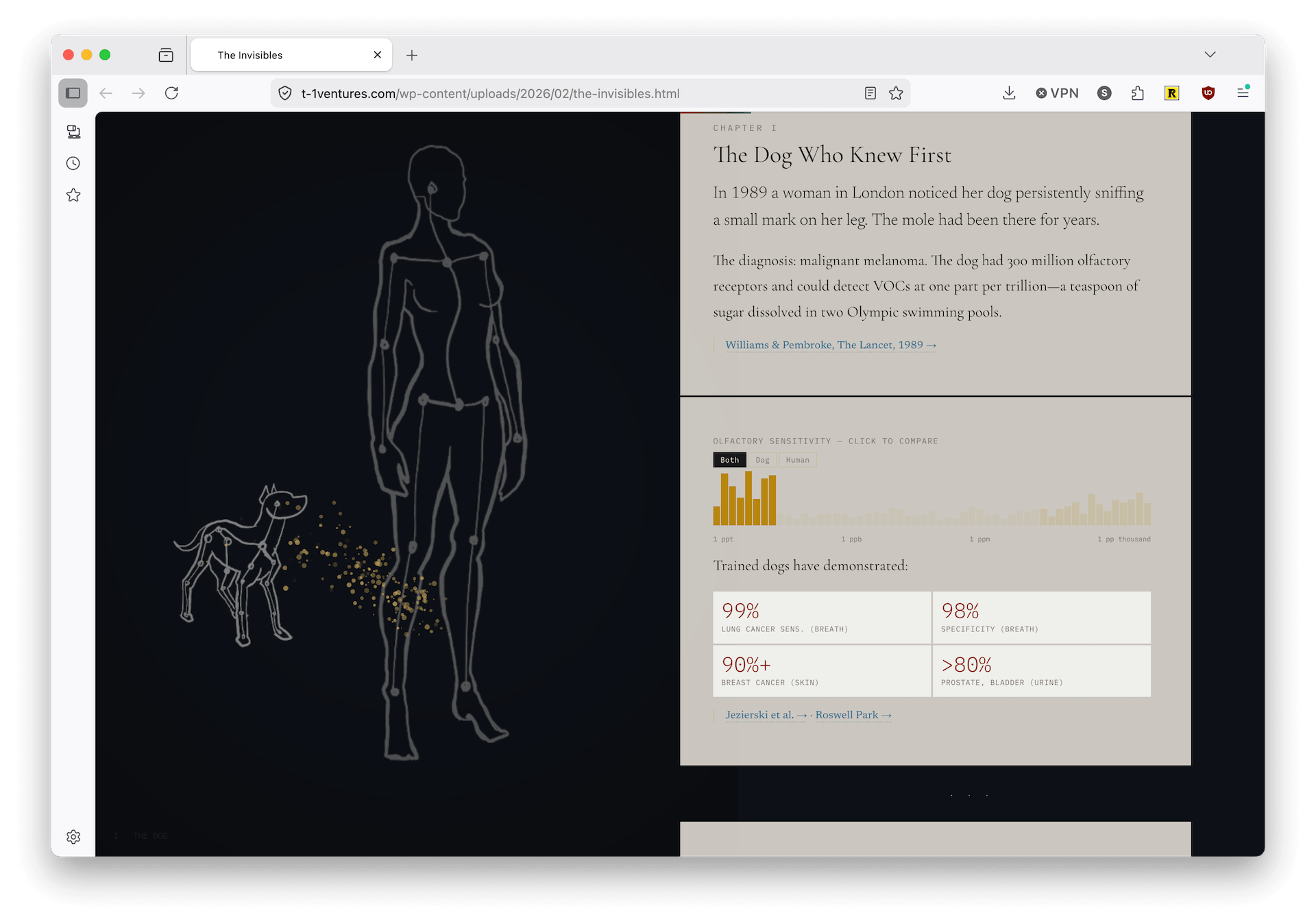
Not much we can do with this knowledge… or is there? See the linked paper at the bottom of this page which asks “What if we could trivially, at a very low cost add new senses to our repertoire?” That aside, I’m sharing this here as I enjoyed how everything is presented and found it to be a quick and engaging orientation to a complex topic.
A simple clustering algorithm for lists
Here is an absolutely delightful find.
There are amazing people who can spot the algorithms in everyday interactions. I still recall how one of my sons figured out the “algorithm” used to solve a Rubik’s Cube. Once understood, this pattern could be transferred to any other cube that also has an odd number of squares (3x3, 5x5, 7x7, etc.).
Here, we see the same kind of engineering observations directed at a children’s toy. Results? The accidental discovery of a (new?) clustering algorithm.
I’ve been experimenting with a human-friendly way to cluster list values using reversals of sub-lists. Or, in normal human words: I was playing with my toddler’s Magna-Tiles and got into a pattern with how I was sorting and grouping them, and turned it into a little… algorithm?
At this point, you should just go watch the video—it’ll make more sense!
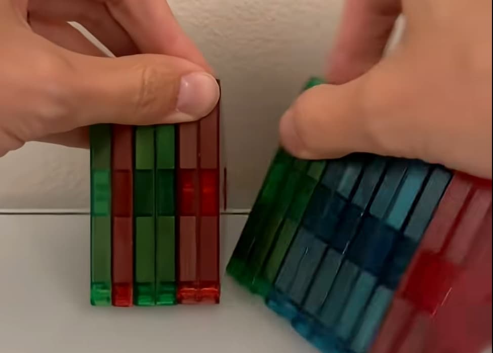
Watched it? Ok.
Pretty cool, huh?
I love these final remarks:
I think this is a really interesting problem in that… it’s way easier to solve this as a physical human being with objects in front of you than it is for a computer to solve it.
Computers don’t easily understand how to grab a group and flip them as we do. Our eyeballs have the “O(1) read” of the state in front of us, and we can just flip the pieces in one “move”.
So… Something, something tangible objects. Visual encodings. Human pattern recognition capabilities. I’ll let you craft the sentence!
Ordinary Abundance
Every now and then, I’ll reflect on how good we have it. Chances are, you have running (clean) water, some form of heating or air conditioning (if not AC then at least a fan or window unit), a working toilet, toilet paper, lights you can turn on after dark… You get the idea. All of these basics are more than what the wealthiest individuals in the world would have had just a few centuries ago.
Anyway, as a kind of homage to dozens of our overlooked luxuries, I present Ordinary Abundance.
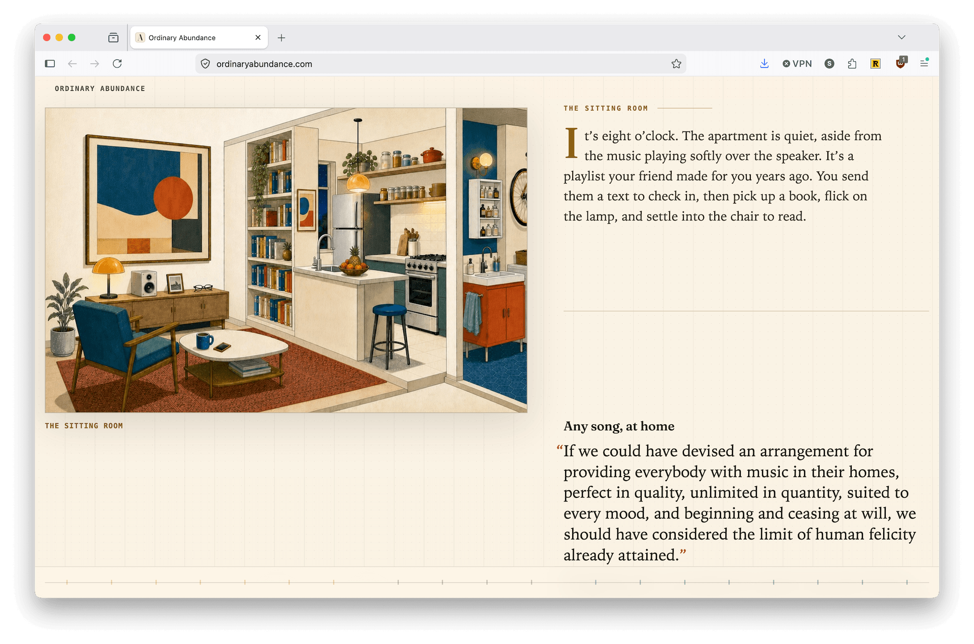
All the items in this room were once out of reach; some not yet invented, others too rare or costly for the vast majority of people. Today, most of us lucky enough to live with them walk past without a second thought.
“Certainty, Variety, and Delight”
If you’re not already familiar with the term ‘wayfinding’, then check out this web page. While ostensibly a marketing web page for RSM Design, it also happens to be a really useful introduction to the field filled with a lot of informative content and links to additional sources.
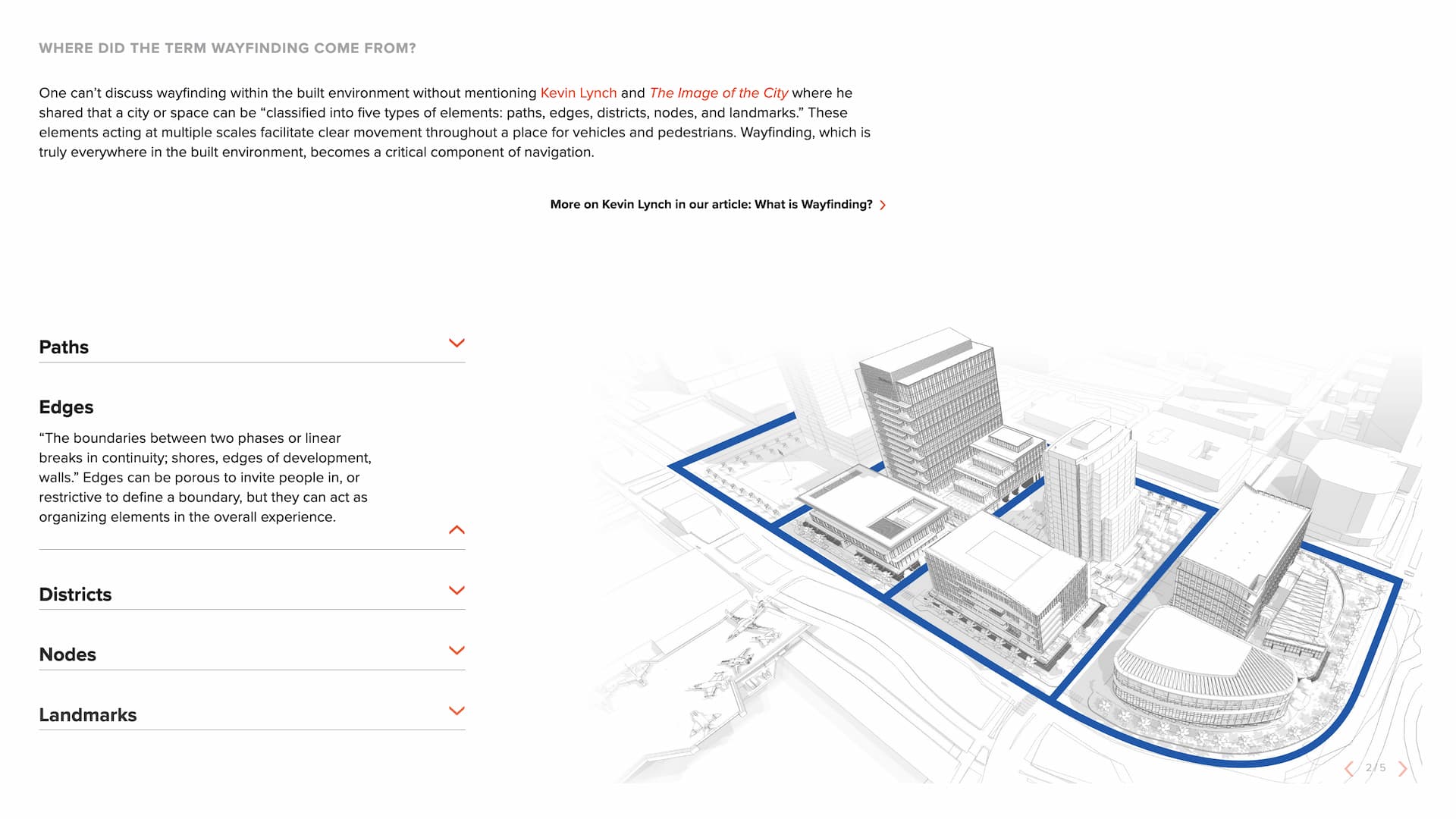
Other than the shout-out to Kevin Lynch and his book The Image of the City, I kind of paused at the focus on ‘Certainty’, ‘Variety’, and ‘Delight’ as the core human needs translated for the built environment.
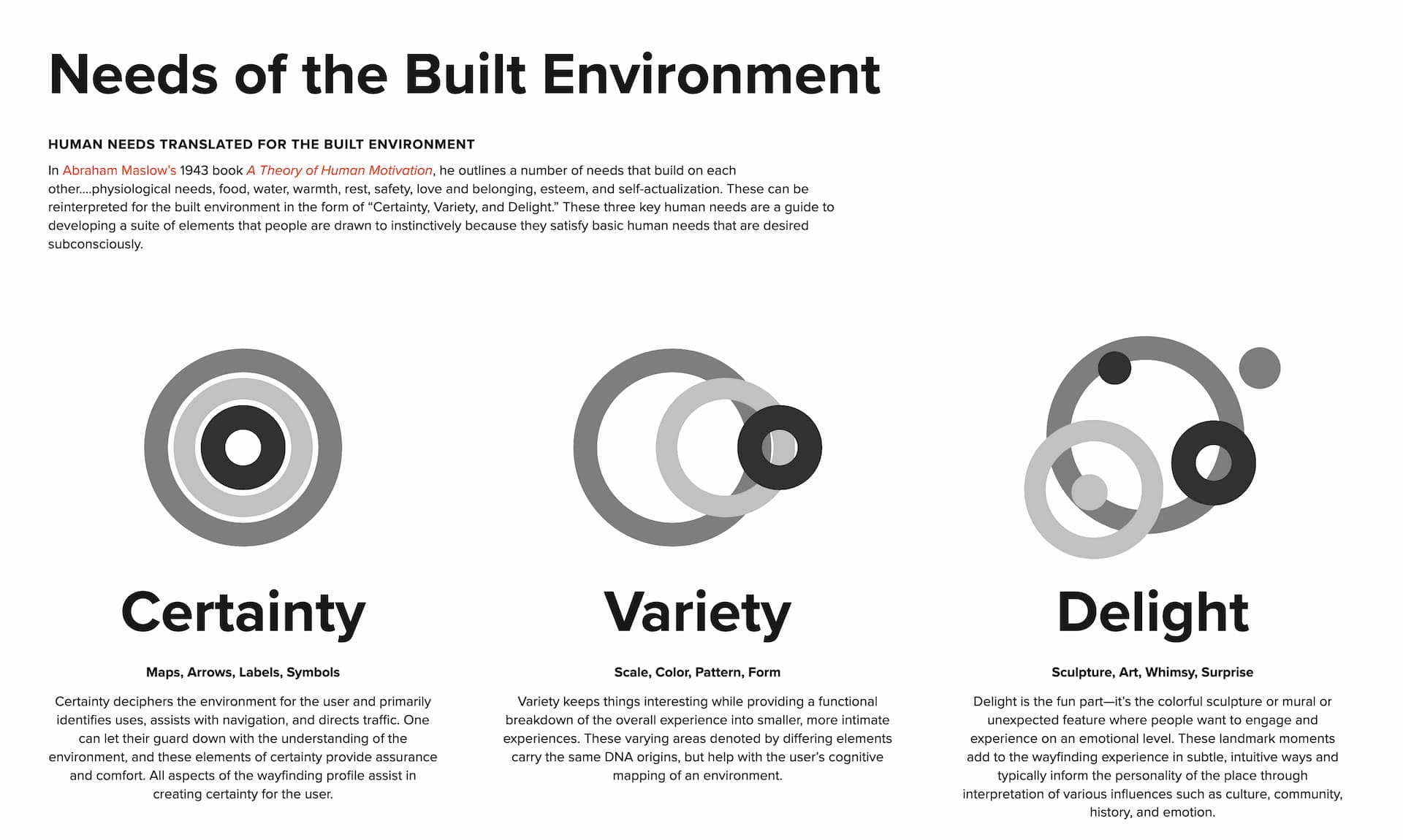
Given the mention of Maslow, and the word “reinterpreted”, I assumed these might be from some subsequent research study, but no. These are three values that RSM has chosen to double down on. But, this doesn’t make them any less valid. Going all the way back to my first book Seductive Interaction Design, I wrote then about the ‘Need for Certainty’ but also—paradoxically—our human need for ‘Surprise’ and ‘Delight’. This was mixed into a longer list of human needs, drives, motivations, urges, and so on. Within the context of wayfinding—I’d say doubling down on just these three human needs makes a ton of sense. It feels like a complete and useful set of values from which to design. And, I couldn’t help but “try these on” in a few adjacent domains (game design, app design, virtual reality, industrial design…). A bit of searching did lead me to this RSM Design post from 2020, several posts about Tony Robbins and his “6 fundamental human values” 🤨, and this post on Storytelling in environmental design with a focus on Star Wars: Galaxy’s Edge and Meow Wolf—two immersive experiences with “very different approaches to storytelling, design, and emotional engagement.”
And… that’s all, folks! Until next issue (in 3 weeks, not 2), stay inside, stay cool. 🥤