№ 125 | Harms of the AI Ecosystem, OK Go Sandbox, Learning Experience Canvas, Family Tree of French Sauces, How Nouns and Verbs Shape Game Design, Harm Along a Spectrum, and Pain Point Bingo

Share
№ 125 | Harms of the AI Ecosystem, OK Go Sandbox, Learning Experience Canvas, Family Tree of French Sauces, How Nouns and Verbs Shape Game Design, Harm Along a Spectrum, and Pain Point Bingo

Harms of the AI ecosystem

At this point, just about anything Per Axbom creates is an instant share from me. His latest creation, an infographic identifying various “Harms of the AI ecosystem” is a fabulous ‘thing to think with’. Brief. Good use of dual coding. Seemingly comprehensive. I was initially missing any explicit spatial arrangement (why are things placed in specific vertical or horizontal positions?), but now I’m less so. This visual, as is, holds space for us to reflect on these items, and in the process engage more critically with each of them. That said, there is an intentional arrangement:

The different platforms are intended to read loosely from the left side as having to do with creation, towards the right-side which illustrates effects from use. All the way to the electronic waste. The bottom row can be seen as the issues that are most invisible. But it's all of course open to interpretation.

Per goes on to state my reason for inclusion here:

The primary intent is to aid conversation and be able to hitch a thought or argument onto one of the islands and explore what other things may relate to it.
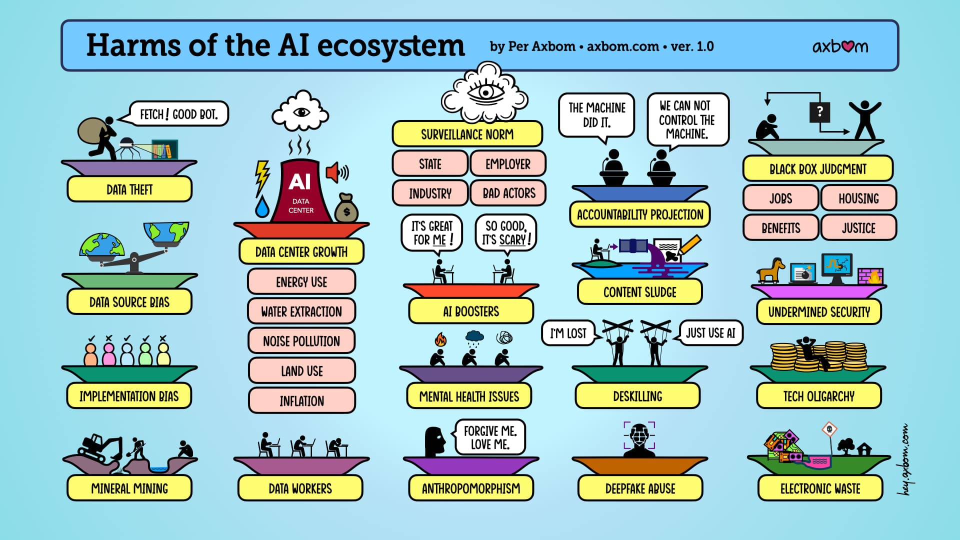
The infographic "Harms of the AI ​​ecosystem" by Per Axbom
The infographic "Harms of the AI ​​ecosystem" by Per Axbom – see long image description.

Most refreshing, in this time when I find myself sifting through so much AI-generated content, is the thoughtfulness and care Per put into this:

The graphic hopefully looks simple enough, as is the intent, but I've been working on it for two months, and there's a lot of anguish and agonizing over both word choice and illustrations. And over what is not included. Hence I can justify these decisions because they are my own, thus empowering myself and the value of the graphic.

🤘

Speaking of care and craft…

OK Go Sandbox

By way of AnnMarie Thomas, I just learned about OK Go Sandbox:

Hello all! For 7+ years, I have collaborated with the band OK Go on our (entirely free to use) education content and events at OK Go Sandbox! I continue to be overwhelmed (in a good way) by the way OK Go's work energizes students and teachers.

Browser window on okgosandbox.org. The hero shows the four members of OK Go in colored jumpsuits (yellow, blue, green, red) holding helmets in front of a desert rig, beside the heading "Inspiring Tools for Playful Learning" and the line "Helping students learn through the joy, wonder, and fun of OK Go's music videos." Below, a "This Too Shall Pass" lesson card sits next to a photo of the band's Rube Goldberg-style chain-reaction machine (a tire rolling down a wooden ramp in a warehouse), tagged with topics Simple Machines, Chain Reactions, and Pitch.

Yes. Just… Yes! What a fun, playful, and fabulous way to bring to life so many science-related concepts!

Oh, and they are “actively searching for corporate (and foundation) sponsors” for some big new initiatives.

Speaking of learning…

Learning Experience Canvas

The Learning Experience Canvas is a new-to-me canvas for, well… planning learning experiences.
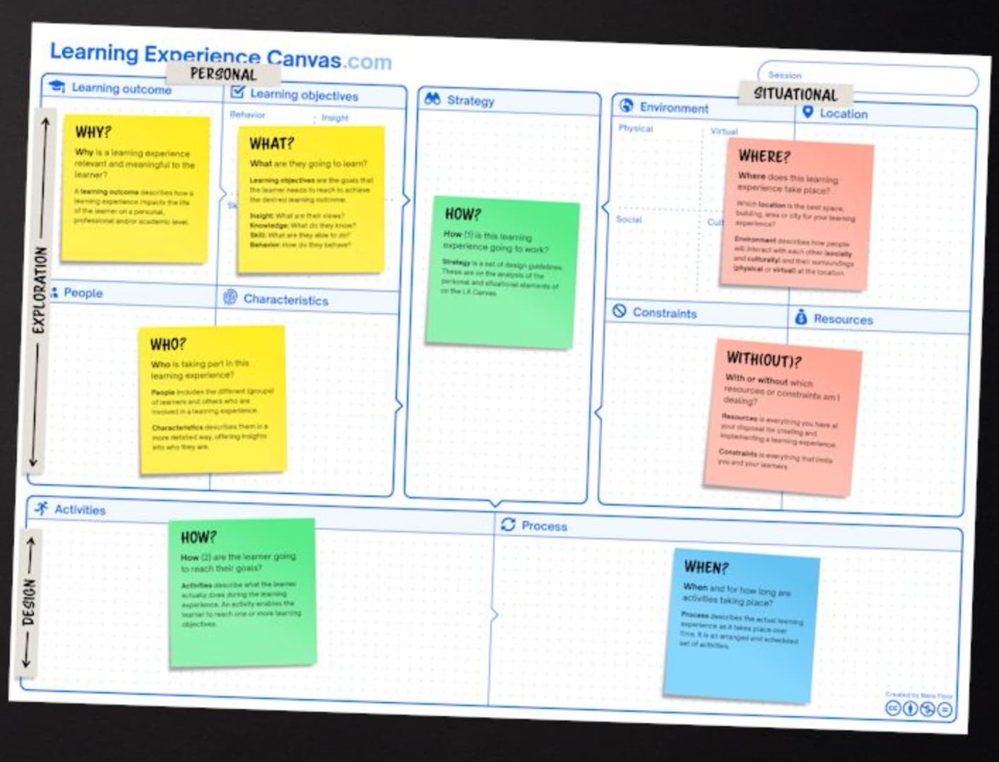
A photo of the printed Learning Experience Canvas (LearningExperienceCanvas.com, created by Niels Floor), a large template of labeled sticky-note zones. Prompts include Learning outcome (WHY?), Learning objectives (WHAT?), People (WHO?), Characteristics, Strategy and Activities (HOW?), Environment and Location (WHERE?), Constraints and Resources (WITH(OUT)?), and Process (WHEN?). Two axes frame it — Exploration to Design (vertical) and Personal to Situational (across the top).

With tools like a canvas, it’s hard to critically assess how good it is until you need to use it for real. But, given the enormous popularity of this canvas, and its grassroots adoption, I’d say it seems like a solid one to add to the collection. I have some fuzzy ideas about designing a learning environment (think the Exploratorium); I’ll give this a test drive with a few of these ideas…

Also, this specific topic is near and dear to me. Aside from my usual interest in all things learning and play, I did, for a period about 10 years ago, consider moving into a more formal learning role (instructional design?). During this time, I developed my own Model for Corporate Learning and Development.
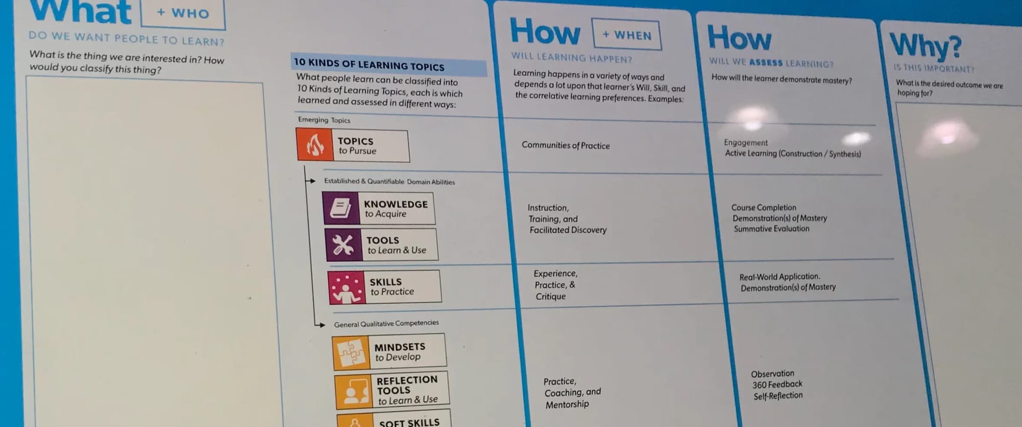
A photographed poster of Stephen P. Anderson's Model for Corporate Learning and Development, laid out in columns: "What + Who — do we want people to learn?", "How + When — will learning happen?", "How — will we assess learning?", and "Why — is this important?". The first column lists "10 Kinds of Learning Topics" grouped as emerging topics, established/quantifiable domain abilities (Knowledge, Tools, Skills), and general qualitative competencies (Mindsets, Reflection Tools, Soft Skills), with matching how-to-learn and how-to-assess methods in the adjacent columns.

Family tree of French sauces

When I stumbled across this Family tree of French sauces [LI], I knew it’d be an instant share! Not much to add, other than that I love visual tools like this that help us to zoom out, look across a landscape of discrete things, and in doing so recognize patterns, similarities, and differences.
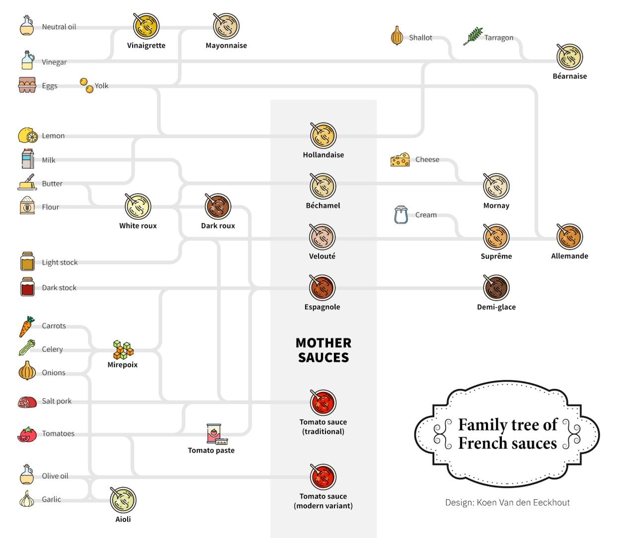
An illustrated "Family tree of French sauces" (design by Koen Van den Eeckhout) tracing base ingredients on the left — oils, vinegar, eggs, dairy, flour, stocks, mirepoix, tomatoes, garlic — through white and dark roux into a central column of mother sauces (Hollandaise, Béchamel, Velouté, Espagnole, and tomato sauce) and outward to derivative sauces including Mayonnaise, Béarnaise, Mornay, Suprême, Allemande, and Demi-glace, each shown as a small pot icon connected by flowing lines.

Oh, and I kind of love this follow-up post [LI] in which “Reddit decided this visual does not qualify as a data visual. Because it has no numbers.” 🙄 Seriously?!

How nouns and verbs shape game design
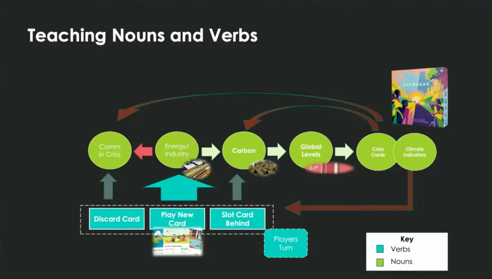
A talk slide titled "Teaching Nouns and Verbs," using the climate board game Daybreak as an example. A row of green circles (the "nouns") — Comm in Crisis, Energy/Industry, Carbon, Global Levels, Crisis Cards, Climate Indicators — is linked by arrows, while teal boxes below (the "verbs") — Discard Card, Play New Card, Slot Card Behind, Players Turn — feed into them. A key labels green as nouns and teal as verbs; the Daybreak box sits top-right.

I don’t know that I’ve ever thought explicitly about how nouns and verbs shape game design (except perhaps while writing the rules for some of my games!). Anyway, here’s a brief introduction to the idea from Professor Andrew Olson, excerpted from a longer talk about Teaching Wargame Design: Going from nothing to something (full video). If you start the video a few minutes earlier, there’s context to this idea, specifically around deriving your nouns from the process schema or actor schema used to map a real world situation. File under… A way to think about game design for real-world problems?

Harm along a spectrum

I might have mentioned the “visual interrogation” toolkit I’m working on, which helps anyone to think more critically about various topics. One of the starting points (I call them “Ideas Worth Exploring”) is the often emphatic binary statement, e.g. ‘there are only 2 types of X’.

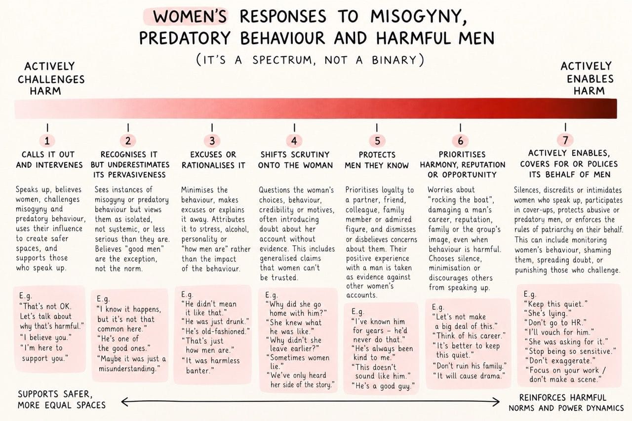
Naturally, I was drawn to this visual exploration of how men and women respond to misogyny and predatory behavior [LI], noting it’s not really a binary response, so much as a spectrum of possible responses, each increasingly harmful.
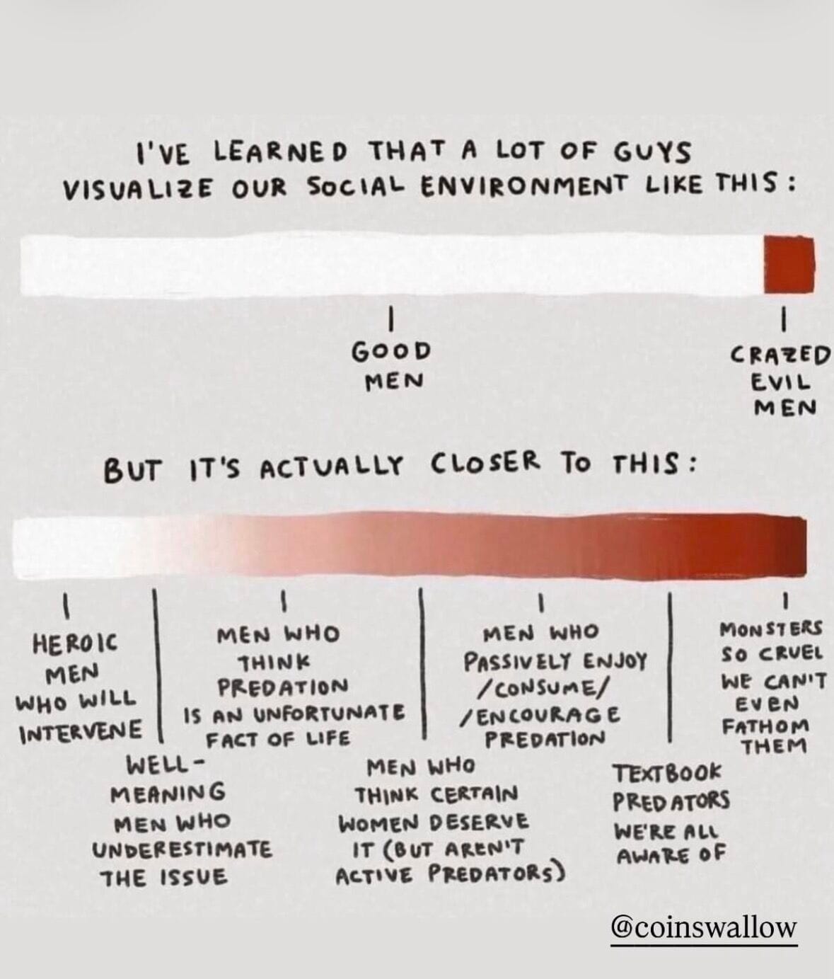
A hand-lettered two-part diagram (credited @coinswallow). The top bar, "I've learned that a lot of guys visualize our social environment like this," is almost entirely light with a small dark segment at the far right, marked "Good men" in the middle and "Crazed evil men" at the end. The lower bar, "But it's actually closer to this," is a continuous gradient from light to dark red with many points along it — from "heroic men who will intervene" and "well-meaning men who underestimate the issue," through men who excuse or rationalize predation, to "textbook predators" and "monsters so cruel we can't even fathom them" — making the case that harm runs along a spectrum, not a good/evil binary.
An infographic titled "Women's responses to misogyny, predatory behaviour and harmful men (it's a spectrum, not a binary)." A gradient bar runs from pale on the left ("Actively challenges harm") to deep red on the right ("Actively enables harm"), with seven numbered stages beneath it: 1) calls it out and intervenes, 2) recognises it but underestimates its pervasiveness, 3) excuses or rationalises it, 4) shifts scrutiny onto the woman, 5) protects men they know, 6) prioritises harmony, reputation or opportunity, and 7) actively enables, covers for, or polices it. Each stage has a short description and example phrases. Footer labels read "Supports safer, more equal spaces" (left) and "Reinforces harmful norms and power dynamics" (right).

Pain Point Bingo

Somewhere else this week, I read a post where someone shared that engagement with their videos significantly increased when the video opened with pains and problems people could readily identify with. I’m sharing this here, as I think that’s some of the brilliance fueling this next find: Pain Point Bingo.
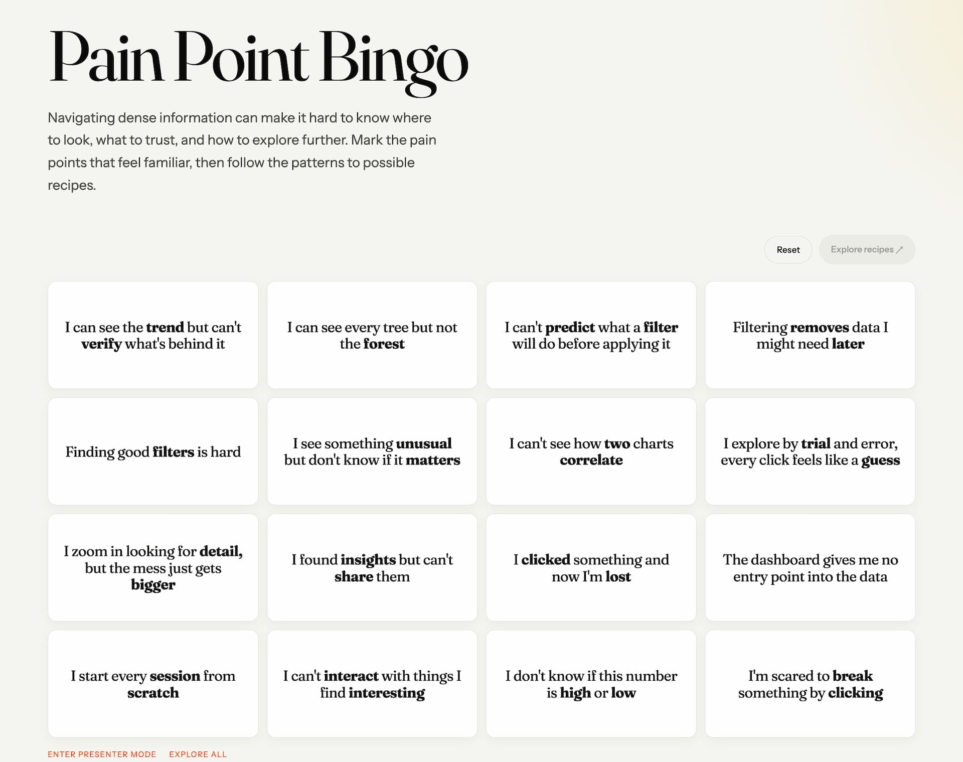
A web page headed "Pain Point Bingo" in large serif type, with the intro: "Navigating dense information can make it hard to know where to look, what to trust, and how to explore further. Mark the pain points that feel familiar, then follow the patterns to possible recipes." Below, a 4×4 grid of first-person pain statements about working with data-dense dashboards — for example, "I can see every tree but not the forest," "I can't predict what a filter will do before applying it," "I found insights but can't share them," and "I'm scared to break something by clicking" — with Reset and "Explore recipes" buttons.

Designed for a talk/workshop on data density, the bingo activity appears to be an opening one, where people self-select the pains they’ve felt. What happens next (and you can play with this yourself) is how the bingo squares—“the frictions we hit when designing for lots of data”—are each a node into a larger network graph, a graph that shows “what actually eases this pain: Interaction Principles, architectures, design patterns, and ways-of-working to navigate information density.”
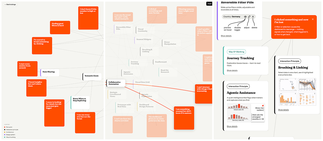
The "graph" view of Pain Point Bingo. On the left, selected pain points appear as orange cards (e.g. "Finding good filters is hard," "I start every session from scratch"). The center is a network graph linking those pains to faded solution nodes — interaction principles, architectures, design patterns, and ways of working such as Direct Manipulation, Brushing & Linking, Agentic Assistance, and Journey Tracking. On the right, detail cards expand individual nodes (e.g. "Reversible Filter Pills — make active filters visible, adjustable and reversible at all times"). A legend keys the node colors by category.

In this way, the bingo game is really a personalized front door into the heart of the talk; by the time you’re exploring, the information—the answers to ‘what can I do about these identified pains?’—is all highly relevant. Nice. 🤩
Source [LI]


Randomness…

So. Many. Cool. (Random). Things. 🤪

Read more

№ 124 | Deep Deck, Charismatic Language, “Are Student Attention Spans Really Shrinking?”, AI Divergence Engine, 10 Things to Watch Out for When Working with AI, “Society Begins at Home”, and Collective Madness Bingo Sheet

№ 124 | Deep Deck, Charismatic Language, “Are Student Attention Spans Really Shrinking?”, AI Divergence Engine, 10 Things to Watch Out for When Working with AI, “Society Begins at Home”, and Collective Madness Bingo Sheet

Deep Deck Let’s kick things off with a good ol’ analog card deck! Deep Deck is a deck of conversation starters that promises to “push strangers closer and pull friends deeper.” Deeper connections and all that. Long-time readers will know how bored I am by most of the

By Stephen P. Anderson
№ 123 | Deep Code Cards, Cultural Differences and Storytelling, “So You Want to Be an American?” (the Game), Work-Life Balance, the Smiley Model, Playful Visualizations—Using Trees!, and Deep Reading

№ 123 | Deep Code Cards, Cultural Differences and Storytelling, “So You Want to Be an American?” (the Game), Work-Life Balance, the Smiley Model, Playful Visualizations—Using Trees!, and Deep Reading

Howdy! Welcome to another roundup of ‘playful things to think with’ and things to think about. Let’s kick it off with… Deep Code Cards Ooh… Another project from Dark Matter Labs. The Deep Code Cards offer a “playful exploration of the invisible forces that shape our lives.” Nice. Maybe

By Stephen P. Anderson
№ 122 | A “Horseshoe” Diagram, Slow AI, the Data Communication Triangle, The Invisibles, A Simple Clustering Algorithm for Lists, Ordinary Abundance, and “Certainty, Variety, and Delight”

№ 122 | A “Horseshoe” Diagram, Slow AI, the Data Communication Triangle, The Invisibles, A Simple Clustering Algorithm for Lists, Ordinary Abundance, and “Certainty, Variety, and Delight”

A ‘horseshoe’ diagram Ooh… A horseshoe diagram?! That’s a new-to-me pattern; I’m adding this to my collection of visual primitives. Pretty much a cycle, with emphasis on the starting and ending points (before the cycle begins again). That’s all. Oh, and as for the content

By Stephen P. Anderson
№ 121 | EVOLUTION: A Card System to Break Automatic Patterns, Visualizing a Billion, Systems Thinking Lessons from Monsters, Inc., The Committee Game, A 3x3 for Assessing Stakeholders, and 6 Ways Leaders Harness Stress

№ 121 | EVOLUTION: A Card System to Break Automatic Patterns, Visualizing a Billion, Systems Thinking Lessons from Monsters, Inc., The Committee Game, A 3x3 for Assessing Stakeholders, and 6 Ways Leaders Harness Stress

Welcome to another edition of Thinking Things, your (mostly) regular roundup of ‘playful things to think with’ and things to think about! EVOLUTION: A Card System to Break Automatic Patterns You might know I’m just a wee bit (ahem) analytical. I like to take “squishy” concepts—conflict resolution, collaboration,

By Stephen P. Anderson